

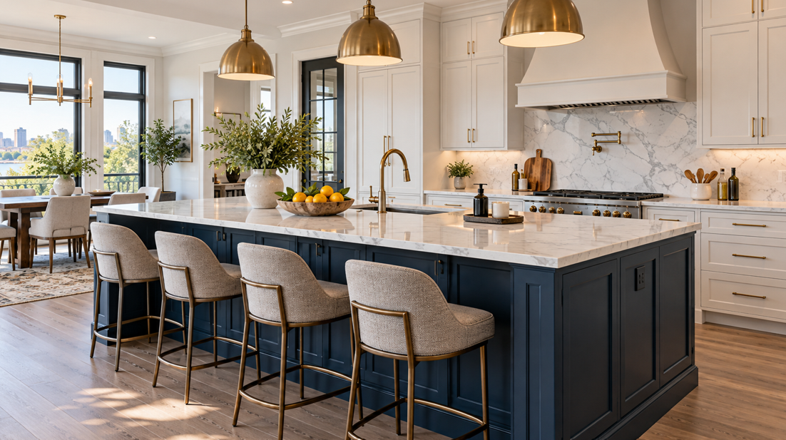
A kitchen island already sits at the centre of everyday life. It is where groceries get unpacked, meals are prepared, children finish homework, and family and friends gather. In 2026, homeowners are increasingly giving that hardworking feature another job: adding personality to the kitchen through colour.
Instead of matching every cabinet in the room, a contrasting island can introduce deep green, navy, warm brown, muted blue, or another grounded shade while the surrounding cabinetry stays quieter. It is a practical way to add character without making the entire kitchen feel busy.
At Dick's Cabinetry & Flooring, we help Franklin County homeowners look at cabinet colour as part of the whole room — flooring, countertops, lighting, hardware, and the natural character of the home all matter.
For West Hamilton Heights homeowners considering a kitchen update, a colourful island can work especially well when the goal is to create a room that feels personal while still being comfortable to live with for years.
Why Are Colourful Kitchen Islands Trending in 2026?
Colour is returning to kitchens, but homeowners are often using it in a more focused way than covering every cabinet in a dramatic shade.
The island is a natural place to experiment.
The National Kitchen & Bath Association's 2026 Kitchen Trends Report identifies the island as one of the leading places where designers expect statement colour to appear. Greens and blues are also among the strongest colour families shaping current kitchen design, alongside warm neutrals and natural materials.
That approach makes sense for real homes. A kitchen island has enough visual weight to make a colour noticeable, but it is separated from the surrounding cabinet runs. That separation makes contrast feel intentional rather than accidental.
A colourful island can also help define different parts of an open kitchen. The main cabinetry may blend quietly into the room while the island creates a focal point around seating, preparation, or entertaining.
For many homeowners, the result is a comfortable middle ground. You can introduce personality without committing the entire kitchen to one bold colour.
That flexibility is particularly useful in Franklin County homes, where traditional, farmhouse, transitional, and updated country styles are common. A deep green or navy island can bring freshness to those familiar styles without making the kitchen feel disconnected from the rest of the house.
Forest Green Islands Bring a Natural, Grounded Look
Green is one of the strongest kitchen colour directions for 2026, and it is easy to see why.
Deep forest, olive, moss, and muted sage tones sit comfortably beside the materials already found in many Pennsylvania homes: wood flooring, stone-look countertops, warm metals, natural textures, and traditional cabinet profiles.
A forest green island can work especially well with warm white or cream perimeter cabinets. The contrast gives the island presence while keeping the wider kitchen bright.
Green also pairs beautifully with natural wood cabinetry. If your wall cabinets are oak, maple, or another warm wood, a muted green island can complement the grain rather than compete with it.
Consider pairing a green island with:
warm white or cream perimeter cabinetry;
white oak or medium-tone hardwood flooring;
brushed brass or warm metal hardware;
cream, beige, or lightly veined countertops;
handmade-look tile backsplashes;
natural wood stools and accessories.
The key is choosing a green with the right undertone.
A heavily blue-green colour can feel cooler and more contemporary. Olive and moss shades generally feel warmer and more traditional. Deep forest green creates stronger contrast and can become the visual anchor of the room.
Lighting matters too. A colour that looks dark and muted under showroom lighting can appear richer when natural daylight enters the kitchen.
For a West Hamilton Heights kitchen with windows looking onto greenery or rural surroundings, a nature-inspired colour can also help connect the interior with the setting outside.
Navy Blue Creates Contrast Without Feeling Too Trend-Driven
Navy has become a reliable choice for homeowners who want more colour than grey or white but still prefer a classic look.
It works particularly well on a kitchen island because the darker tone visually grounds the centre of the room. Surrounded by light cabinetry and countertops, navy creates contrast without requiring a highly decorative door style.
A Shaker-style island in deep navy, for example, can feel appropriate in both traditional and updated kitchens.
Navy pairs particularly well with:
white or warm-white cabinets;
natural wood flooring;
light quartz or stone countertops;
brushed nickel, brass, or black hardware;
warm timber accents;
patterned or softly coloured backsplash tile.
One advantage of navy is its flexibility. Changing stools, pendant lights, hardware, or accessories later can move the room in a more traditional, coastal, farmhouse, or contemporary direction without replacing the island cabinetry itself.
The depth of the colour also helps disguise some of the visual wear that can appear around a hardworking kitchen island.
That does not mean every navy is equally practical. Very dark finishes can show dust, fingerprints, and crumbs under strong lighting, especially on completely flat cabinet fronts. The finish matters as much as the shade.
A softer satin or matte appearance often fits the warm, comfortable character many Franklin County homeowners prefer.
Earthy Browns and Wood Tones Offer a Softer Alternative to Painted Colour
A bold island does not have to be blue or green.
One of the biggest cabinet shifts in 2026 is the renewed interest in natural wood. Houzz's 2026 kitchen research found wood cabinetry moving ahead of white among renovating homeowners, while NKBA trend research also points towards greater interest in visible wood grain and warm, organic materials.
That makes a wood island an excellent option when you want contrast without adding another painted colour.
For example, warm white perimeter cabinets can be paired with a white oak, medium brown, or stained wood island. The island still stands apart, but the contrast comes from natural grain and warmth rather than a highly saturated finish.
This combination fits especially naturally into the farmhouse and rural-home character found throughout South Central Pennsylvania.
A wood island can also connect several finishes in the same room. If you already have hardwood or wood-look flooring, timber ceiling beams, a wooden dining table, or warm-toned furniture nearby, the island can help carry those materials through the kitchen.
The woods do not need to match exactly.
In fact, trying to make every wood finish identical can sometimes make a room feel overly coordinated. Related undertones are usually more important. Warm woods tend to sit comfortably together when one finish is clearly lighter or darker than another.
When exploring new cabinetry, it is worth viewing painted and natural wood samples beside your flooring and countertop choices. Cabinet colours rarely exist in isolation, and seeing the materials together makes it easier to judge whether the contrast feels balanced.
Muted Blues Add Colour Without Overpowering the Kitchen
Not every statement island needs a deep, dramatic shade.
Dusty blue, slate blue, blue-grey, and muted denim tones can give a kitchen more personality while keeping the atmosphere relaxed.
These colours can be particularly effective in smaller kitchens where a very dark island might feel visually heavy.
A softer blue pairs easily with white, cream, grey, and natural wood cabinetry. It also works with many countertop patterns because the colour can sit quietly beneath the stronger movement in stone or quartz.
For homeowners who are nervous about colour, muted blue is a useful starting point.
It is clearly different from neutral perimeter cabinets, yet it does not demand attention in the same way as a saturated navy or emerald green.
The combination can also work well in older homes where the goal is to update the kitchen without making it feel out of character with the rest of the property.
Consider keeping surrounding materials warm if the blue has cool undertones. Wood flooring, warm metal hardware, cream paint, or natural woven textures can prevent the room from feeling cold.
How Do You Choose an Island Colour That Works With the Rest of the Kitchen?
The best island colour is not necessarily the colour getting the most attention online. It is the one that makes sense with the fixed elements already in your kitchen.
Start with the materials that are unlikely to change frequently.
Look at the Flooring First
Flooring covers a large visual area, so its undertone matters.
A warm oak floor often works beautifully with forest green, navy, warm brown, muted blue, or cream. Cooler grey flooring may pair more naturally with blue-based colours and cooler neutrals.
If the kitchen connects directly to other rooms, also consider the flooring visible beyond the kitchen itself.
Consider the Countertops
Countertops frequently sit directly above both the perimeter cabinets and island, making them one of the most important connecting materials.
If your countertop has noticeable veining, look closely at those smaller tones. A subtle grey, blue, brown, green, or warm beige vein can provide a natural starting point for an island colour.
For highly patterned countertops, a quieter cabinet colour often creates better balance.
Pay Attention to Existing Cabinet Colour
Contrast works best when the two cabinet colours are clearly intentional.
Warm white cabinets paired with forest green create an obvious but comfortable difference. Light wood cabinets beside a deep blue island also read clearly as a planned combination.
Two colours that are extremely close can sometimes look as though one was intended to match and missed.
Think About Natural and Artificial Light
Cabinet colours can change considerably throughout the day.
Morning sunlight may bring out warm undertones. Cooler artificial lighting can make the same colour look greyer or bluer in the evening.
Viewing a larger sample in the actual room is helpful because a small colour chip cannot fully show how a finish will behave across an entire island.
Can the Island Colour Be Different From the Rest of the Cabinets?
Yes. In fact, creating deliberate contrast between the island and perimeter cabinetry is one of the easiest ways to make a two-colour kitchen feel organised.
The colours do not need to match, but they need something that connects them.
That connection can come from the countertop, hardware, flooring, backsplash, door style, or wood undertones.
For example, white Shaker cabinets and a green Shaker island already share the same door profile. Add the same hardware and countertop across both, and the kitchen feels unified even though the cabinet colours are different.
Another approach is pairing painted perimeter cabinets with a natural wood island. The colour changes and material changes, but repeating the same countertop or hardware helps tie the room together.
For homeowners who want a more restrained look, keep the island as the main contrast and allow the other major finishes to stay quieter.
If the island is forest green, for example, a simple countertop and understated backsplash give that colour more room to work.
How Does Pennsylvania's Summer Light and Humidity Affect Cabinet Choices?
July in South Central Pennsylvania brings warm temperatures, strong natural light, and higher humidity than the dry winter months.
That seasonal light can make cabinet colours appear different from how they look during winter. Deep greens may look richer, blues can become brighter, and warm wood tones can show more variation when sunlight fills the room.
For that reason, viewing samples in your own kitchen is valuable when choosing a statement island colour.
Humidity is also worth considering with real wood cabinetry. Wood naturally responds to changes in moisture levels through the seasons. Pennsylvania homes move between humid summers and considerably drier indoor conditions once winter heating begins.
Good-quality cabinet construction and reasonably stable indoor conditions help manage that natural movement.
July can also be a useful time to start planning a kitchen update. Homeowners considering work before autumn or the holiday season have time to compare cabinet colours, look at samples, finalise the layout, and consider how the island will function as well as how it will look.
Your Island Can Be Beautiful and Practical at the Same Time
Colour may be what catches your eye, but the best kitchen islands earn their space every day.
Before choosing the finish, think about what you need the island to do.
It might include:
wide drawers for pots and pans;
waste and recycling pull-outs;
tray or cutting-board storage;
electrical outlets for food preparation;
seating for family meals;
extra countertop preparation space;
storage for serving pieces;
shelves for cookbooks or display items.
This is where design inspiration becomes practical planning.
A beautiful navy island with poor storage will eventually become frustrating. A well-organised island in a colour you enjoy gives you both the visual impact and the everyday function that make a renovation worthwhile.
The size of the island matters as well. A larger island can handle a deeper colour because there is enough room around it for the finish to breathe. In a tighter kitchen, a medium or muted tone may keep the centre of the room feeling lighter.
Whatever direction you take, the goal is a kitchen that works for your household rather than a room designed around a photograph or short-lived trend.
Bring More Colour to Your West Hamilton Heights Kitchen
A contrasting kitchen island is one of the most approachable ways to add personality to a kitchen in 2026. Deep forest green can bring an earthy, grounded feeling. Navy creates classic contrast. Muted blues add softer colour, while natural wood offers warmth and texture without relying on painted finishes.
For West Hamilton Heights homeowners, these colours also fit comfortably with the traditional, farmhouse, and transitional influences seen throughout Franklin County.
The right choice depends on your flooring, countertops, lighting, surrounding cabinets, and how you want the room to feel. More importantly, the island still needs to work hard as storage, preparation space, seating, or a combination of all three.
Dick's Cabinetry & Flooring has served Chambersburg and the surrounding Franklin County communities since 2013. Our team can help you compare cabinet colours and finishes, think through your island layout, and select options that fit your home and budget.
If you are planning a colourful kitchen island or a larger cabinet update, request an estimate or visit our Chambersburg showroom at 1649 Lincoln Way East to explore your options in person.


